
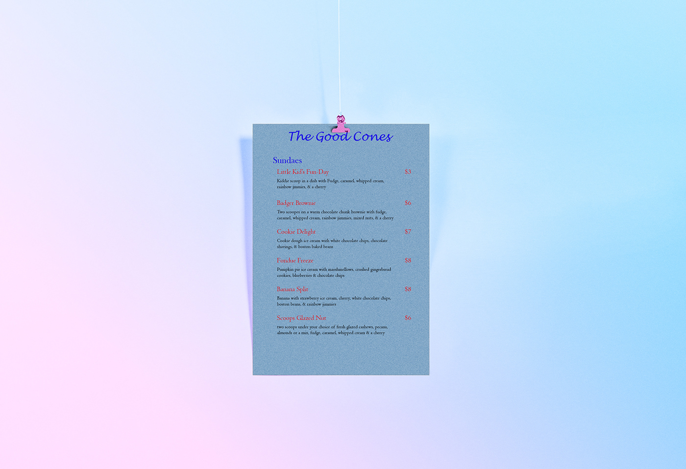
Menu Exercise: I chose the idea of ice cream for my Menu poster is because I like ice cream. I really like the name that I gave my ice cream shop, and the color scheme as well. I felt that Blue went well with Red and Black. The font type that I used for the name of the ice cream shop; I feel looked really cool. I could have done more with this project in which I could have made it more distinct and exciting instead of bland looking, but I have learned for next time when making a menu poster. Overall, I think that I did an ok job at it.


